In part three of our series on financial dashboards, we’re going to explore ways to ensure your dashboards stay relevant throughout the year. If you missed the first two parts, we outlined how to build dashboards, and how to use them to make more informed business decisions.
As a business owner or financial manager you probably already know that the only constant in life (and business) is change. Customer preferences change, markets evolve and businesses need to adapt. Sometimes those external changes can make your plans completely irrelevant.
As a result, your key focuses may also need to shift in order to reflect the current challenges of the business. For example, you may have started the year with a laser focus on growing sales to meet some ambitious targets. Fortunately, due to a shift in the market, you’ve now got a pretty intense backlog. Now you need to focus on making sure your record sales also means record profit.
Keeping your dashboards relevant means always making the most important information readily available and easily accessible. This can only be accomplished through continuous evaluation of the state of the business and ensuring that the dashboards are accurately reflecting that state.
Building a proper dashboard
At its core, a great dashboard allows you and your team to see the big picture at a glance. In the not-so-distant past, this was sometimes easier said than done. Luckily, with modern financial reporting tools like Jirav, creating custom, real-time dashboards is no problem.
Having access to all the relevant data is one of the most important aspects of a great dashboard. As such, the first key criteria for setting it up is to link it to all of your key data sources with the dashboard.
Once everything is linked, you’ll be able to get started combining and visualizing your data. Because information serves as the backbone of your dashboard, it’s critical that your data gets regular, automatic updates. Having everything linked has the added benefit of eliminating manual data aggregation and massive copy/paste exercises.
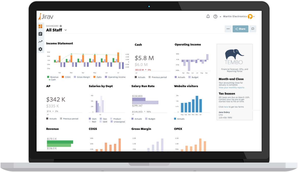
In addition to the standard plan and actual comparisons, Jirav’s intuitive, point-and-click interface allows you to build your own custom tiles. You can even use multi-series tiles to present complex data and beautifully visualize any KPI.
Because different stakeholders have different needs and requirements, it’s also important to be able to customize the data and view of each person with access to the dashboards. Having all key data in one place, allows you to securely share the dashboards in seconds to only the people who should see it.
Beyond merely providing information, a dashboard provides real value when it’s used to drive action. Thus, in order for the dashboard to be truly effective, all relevant parties must have access to and understand their key metrics.
Access to various dashboards in Jirav is fully customizable. For example, the board and senior management teams have their dashboards, with a view of the overall company. At the same time, a lower-level sales manager can also have access to his team’s most important KPIs.
Each team can focus on deriving action plans from the relevant information in their dashboards.
Continual evaluation
Your business is constantly evolving. As it does, your focus needs to change along with it. As such, it only follows that your dashboards also need regular re-alignment to the needs of the business and the team.
If you’re responsible for implementing and maintaining your company’s dashboards, there are a few key questions you can ask yourself to ensure that your dashboards are serving their purpose optimally.
Are there more important metrics?
When it comes to metrics and KPIs, there are a few key mistakes that people sometimes make as they design their company’s dashboards and reporting. They tend to try to include far too many metrics, crowding the view and causing the user to be confused about where the focus should be.
Or, they may stick to a few outdated KPIs that they’ve been using forever. Staying with what’s familiar means never asking if there might be other, more relevant KPIs. It could be that there are better metrics available that might drive more or different actions.
Is the dashboard accurate on a timely basis?
How often is the dashboard (or certain KPIs) updated? For your dashboard to have the best effect, it needs to drive timely action. Timely action requires data that is current. It’s important to be sure your dashboard is being updated to match the rate of change in the business.
For example, many financial metrics are most accurate when updated monthly. Major cost drivers like personnel costs and other operational expenses might only be booked monthly or bi-weekly. As such, it may make sense to look at the P&L and balance sheet parts of your dashboard in the same rhythm.
On the other hand, there are other operational figures which may lend themselves very well to daily or even real-time updates. Sales, website visitors and conversion rates may change quickly depending on the type of business. As such, constant tracking of these KPIs may be beneficial, allowing for quick reflection and action as needed.
Is the team using the dashboard?
It’s also important to check in regularly with the dashboard’s users and get their input.
- What do they like?
- What do they dislike?
- Are they using all of the available features?
- What would they like to see that isn’t currently available?
If key people aren’t using the dashboards, it’s crucial to dig in and find out why not. What do they say would need to change in order to encourage more frequent use?
Remember, the biggest value of a dashboard comes from the team using it to drive operational actions.
How to succeed with dashboards
Getting your dashboards to succeed requires a few key things.
First, all relevant data sources must be properly integrated. This means no manual inputs and no copy and pastes to and from complex excel spreadsheets.
Since the data is being automatically integrated, it must also be automatically reconciled. This means data and figures are cross-checked automatically, ensuring plausibility and accuracy. In addition to this being critical for your dashboard, it’s also a big efficiency gain. Eliminating discussions about data accuracy and manually cross-checking large tables saves you and your team hours (or days!) each month.
Start simple. Don’t try to do it all in one shot or make the system overly complicated at the beginning. Start with small wins and easy to understand KPIs. When those are implemented and successful, slowly but continuously expand until the dashboard shows a comprehensive picture of the business.
Finally, build the visuals into your meeting cadence. Show the big picture and individual KPI tiles from the dashboards regularly in your meetings. This builds familiarity and a level of comfort in the organization. This also gives the team a chance to ask questions about the metrics and what they mean. Understanding what’s shown in the dashboards will help the team be able to visualize the effect of their inputs on the performance of the company.
Remember, dashboards are only valuable if they are regularly used by the team. Well-designed dashboards can help you ensure your team’s attention is focused on where it’s needed the most.


