This month, the R&D team has been hard at work making user experience improvements across the Jirav app:
- Dashboard charts look better with less white space
- Add/Edit/Clone Standard Drivers across modules
- Feature announcements inside the app
- New KPI: % Salary by Department / Role
- Miscellaneous user interface enhancements
Let’s dive in!
Dashboard charts look better with less white space
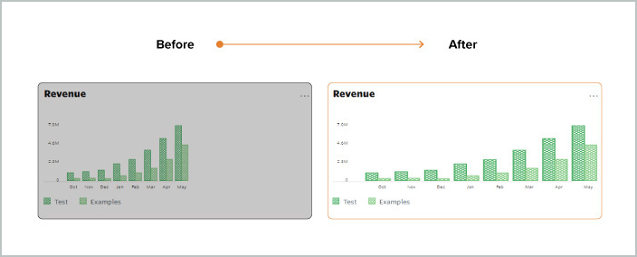
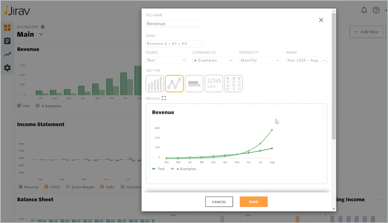
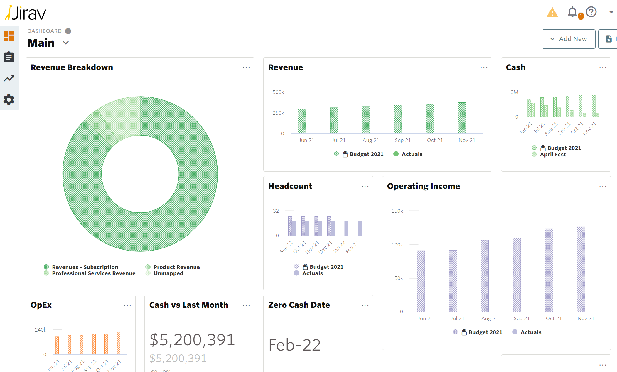
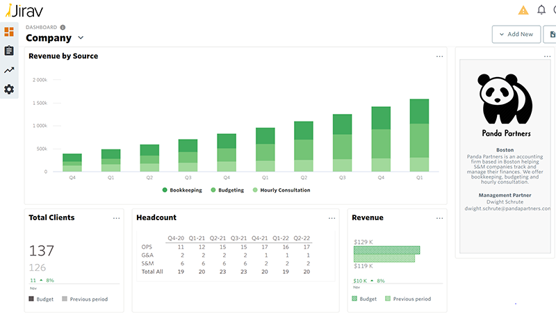
Don’t like to see unnecessary white space in your dashboard tiles? Neither do we! With this release, the width of your bar charts will automatically adjust to fill up the white space, giving your dashboards and reports a more polished look.
Add/Edit/Clone Standard Drivers across modules
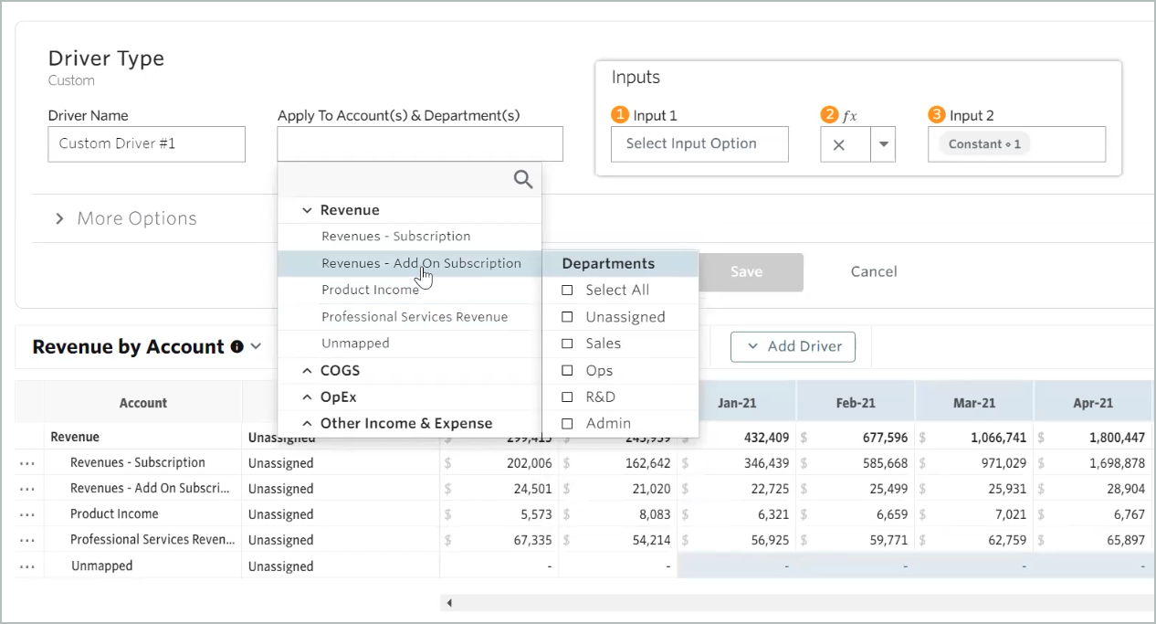
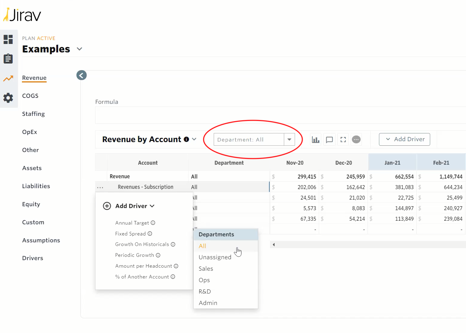
In our May Release, we enabled bulk editing, deletion, and cloning of Standard Drivers — but only within the same module. Now you can add and clone drivers to multiple modules all at once. You can also edit a single driver and change the account/department to a different account/department combination in a different module.

Bulk driver editing, deletion, and cloning
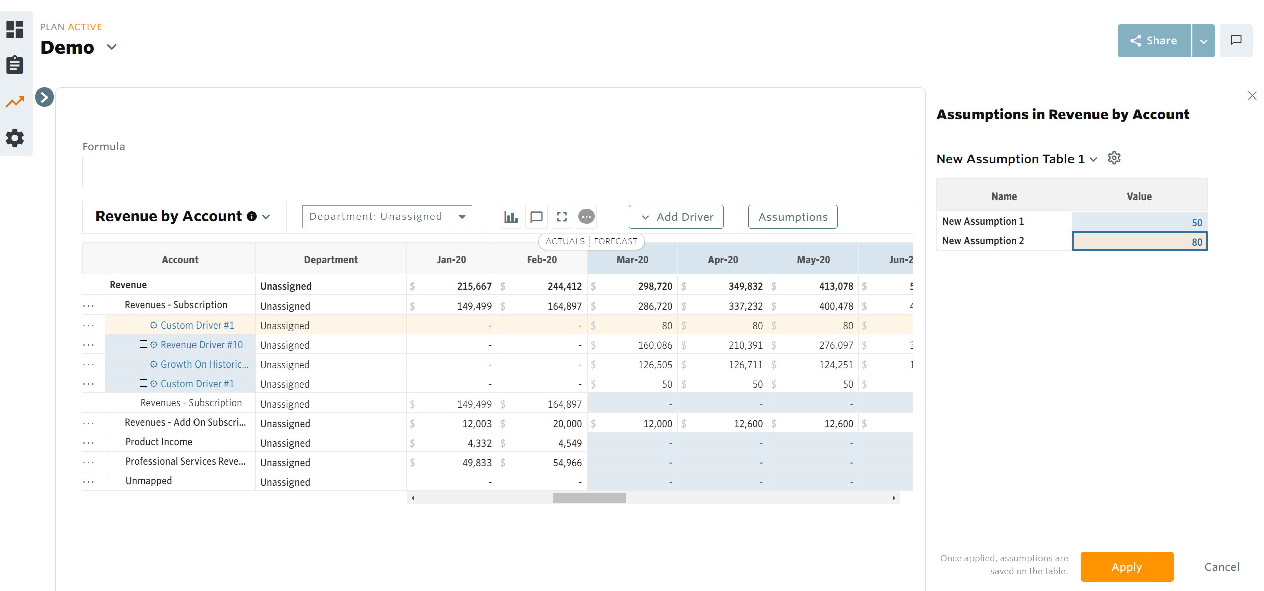
The addition of Bulk Driver Creation in our March Release made it super easy to build dozens of similar drivers in one go — but what if you want to change those drivers after the fact? Now you can just as easily bulk edit, bulk delete, and bulk clone drivers.
Product announcements inside the app
We added an announcement feature which will allow us to highlight future product releases to you directly in the app, meaning you won’t have to wait for an update via email or on the blog to hear about the latest and greatest new features.
New KPI: % Salary by Department/Role
We added a new key performance indicator: % Salary by Department / Role. This KPI allows you to derive the percent of salary for a particular department and/or role against the total salary amount.

Warning for plan date changes
Changing plan dates can have a big impact on report outputs, so we’ve added a warning when a user tries to change the date ranges on a plan. Jirav will let them know about the potential impact on report outputs and require a confirmation. If a user moves the forecast start date later, we also warn them that forecast data entered in the plan may be overwritten with actuals data.

Other user interface enhancements
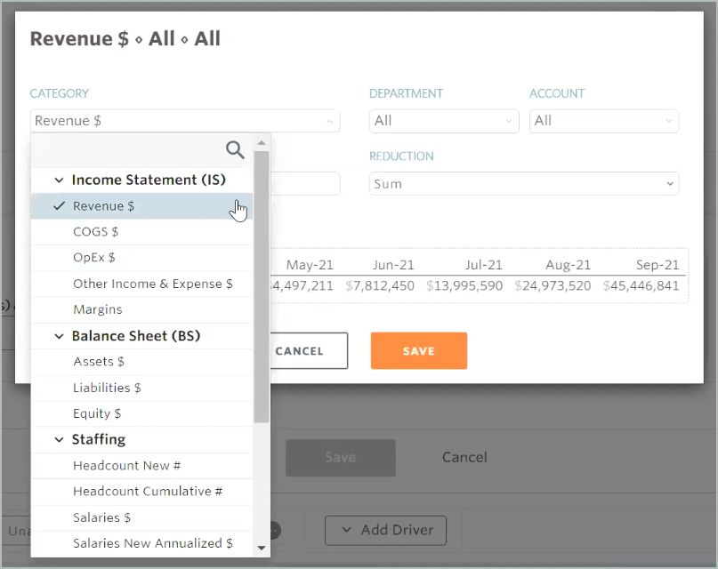
We made a number of small user interface improvements to make the app easier to navigate and use. For example, the Category dropdown is now organized by module rather than presented as a single list.
Helpful June 2021 release links
That’s all for now! I hope you enjoy our latest features and fixes. Here are a few helpful links to accompany this release:


