Summary: I built a spreadsheet model to demonstrate the impact on saving lives of implementing controls sooner rather than later to contain the spread of coronavirus. You can copy the model, edit the assumptions, and run your own scenarios.
If you enjoy this post, I recommend you also watch our recorded webinar on the same topic (video below).
Revisiting the March 9 coronavirus model
What a difference three weeks make.
Back on March 9, here on the Jirav Blog, I published a simple spreadsheet model for forecasting the exponential growth of coronavirus infections and the impact of controls on limiting that growth.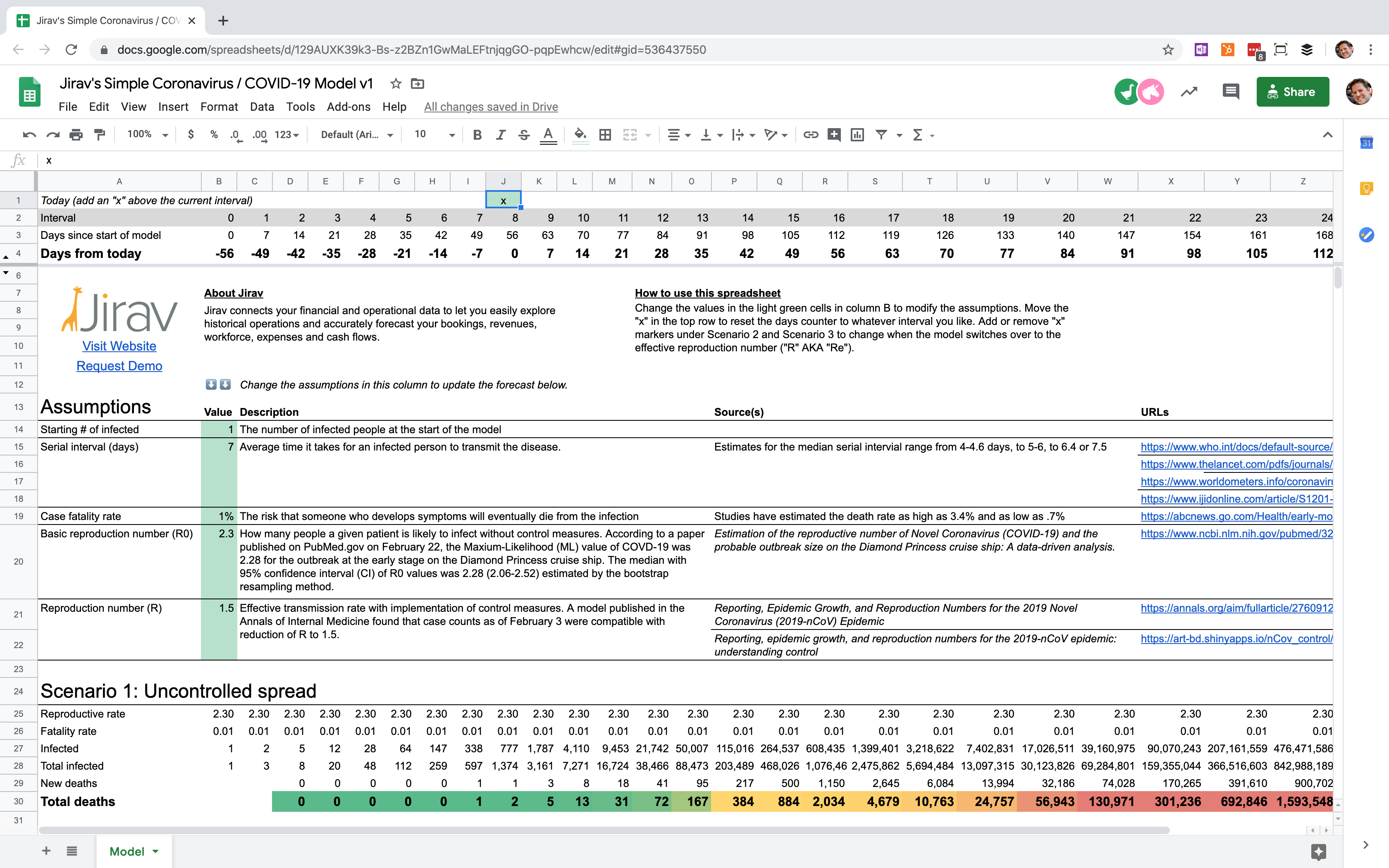
We didn't have a ton of publicly available data on coronavirus at the time, so the goal of that model wasn't to predict the ultimate number of deaths, but rather to demonstrate how important it is to act quickly to stop the spread sooner rather than later.
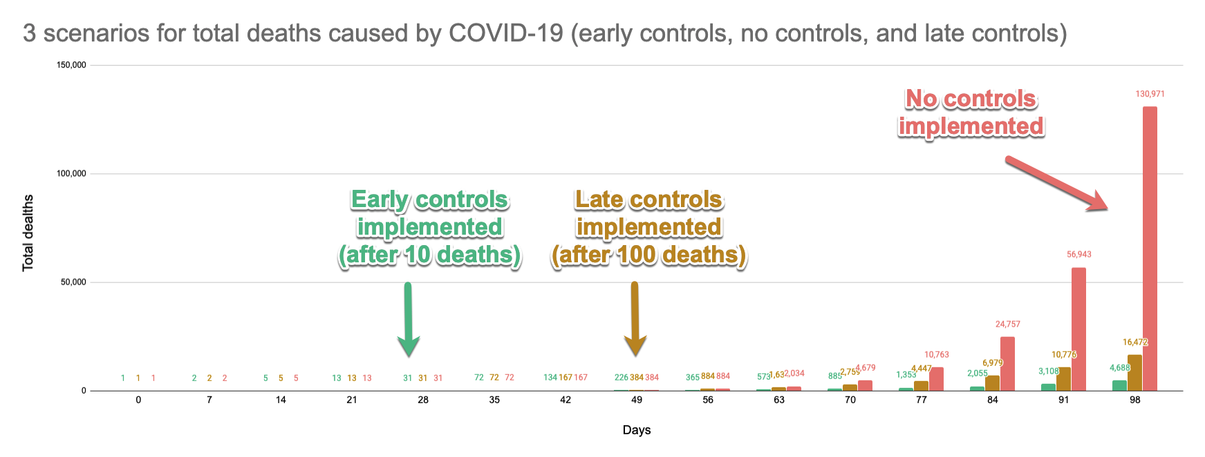
In the chart above, each color represents a different scenario. The only thing different in each scenario is how quickly the government implements controls such as those Washington state set in early March, which included closing restaurants, non-essential businesses, asking residents to stay at home, advising on social distancing guidelines, and more.
It's obvious from the chart that implementing controls after 10 deaths versus 100 deaths results in dramatically fewer cumulative deaths in about a two-month period. More than 10,000 lives are saved. And both the green and yellow scenarios are clearly preferable to the red doomsday scenario in which no controls are implemented.
This post is part of a series on modeling the COVID-19 impact using spreadsheets. Be sure to read the other articles in the series for the latest models and information.
- Part 1: A simple model for forecasting the impact of coronavirus and controls (March 9)
- Part 2: Reforecasting the U.S. COVID-19 Impact (March 30)
- Part 3: Forecasting the End of COVID-19: Herd Immunity (April 29)
Comparing the March 9 forecast vs. actuals
All good financial modelers know that it isn't enough to just build a model and a forecast and be done with it. That's just the beginning. You also have to revisit your model at least every quarter (ideally every month) and compare the actuals to your forecast.
So that's what I did on March 26, just over two weeks later.
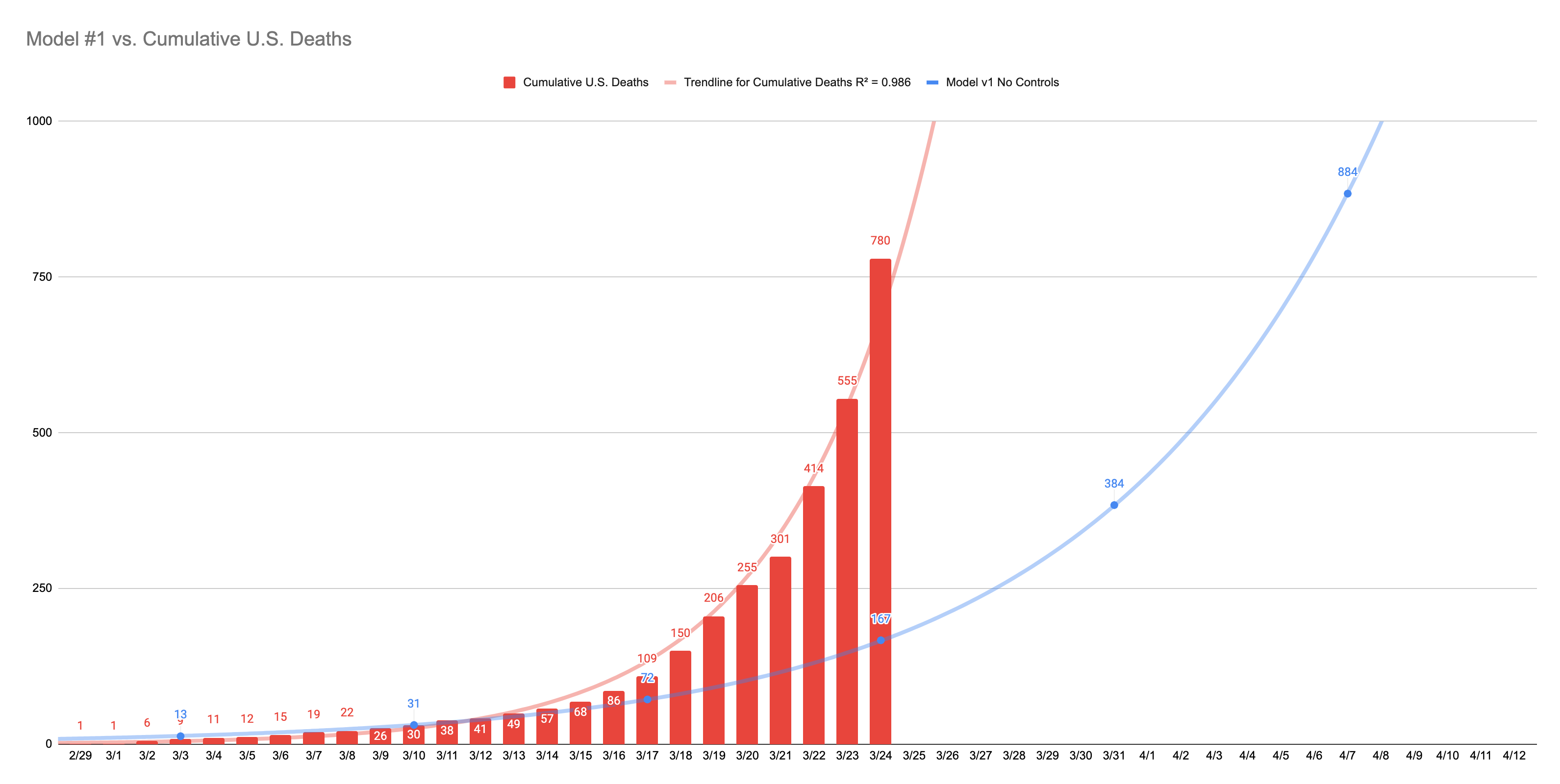
Uh oh.
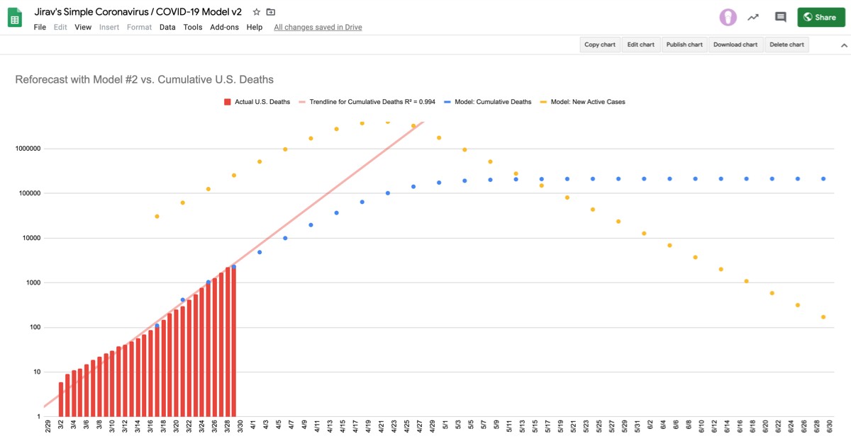
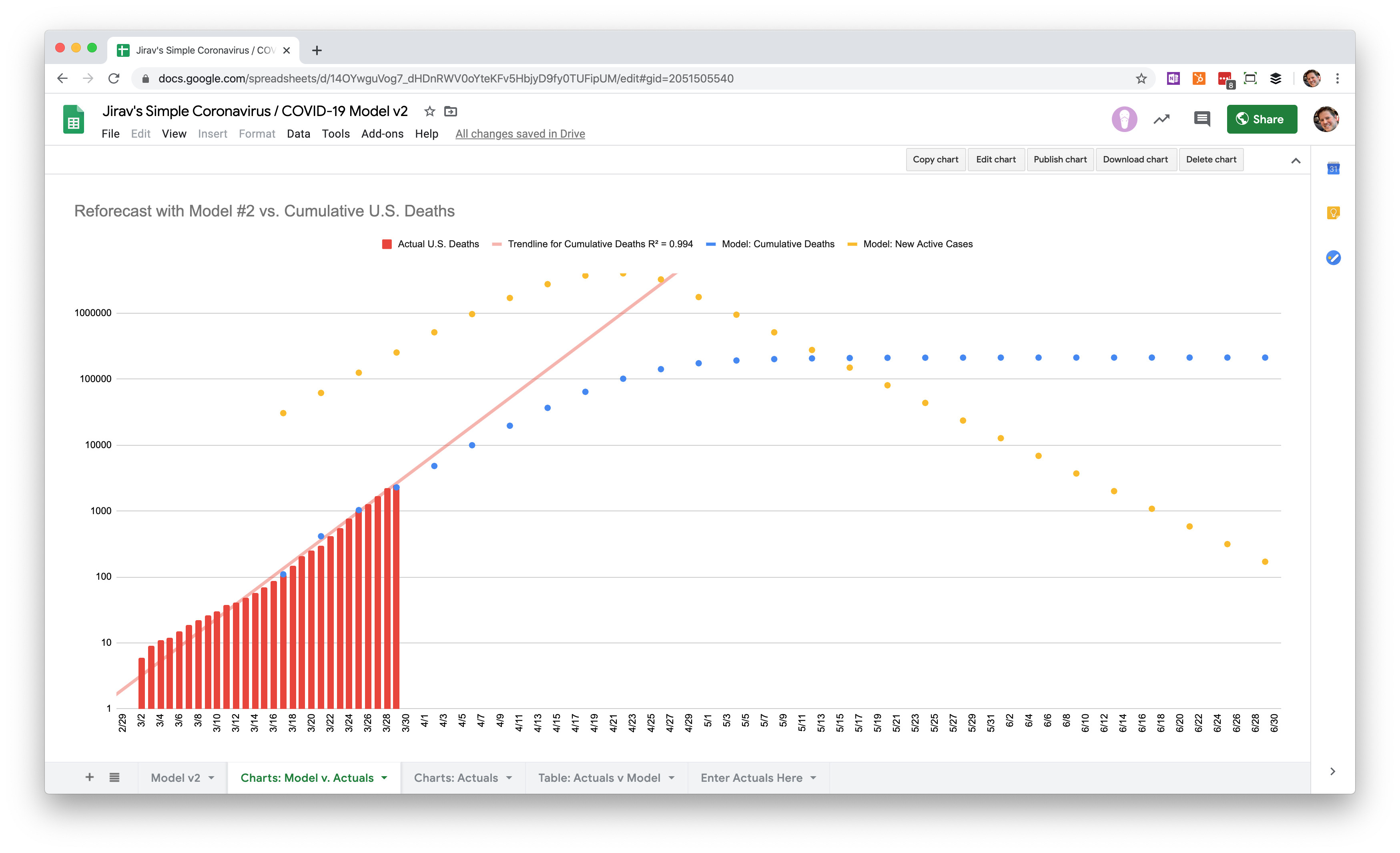
The actual U.S. deaths from coronavirus (red bars) were clearly outpacing my model's forecast (blue line).
This is easier to see on a logarithmic scale, which compresses the vertical axis so that an exponential growth curve appears as a straight line.
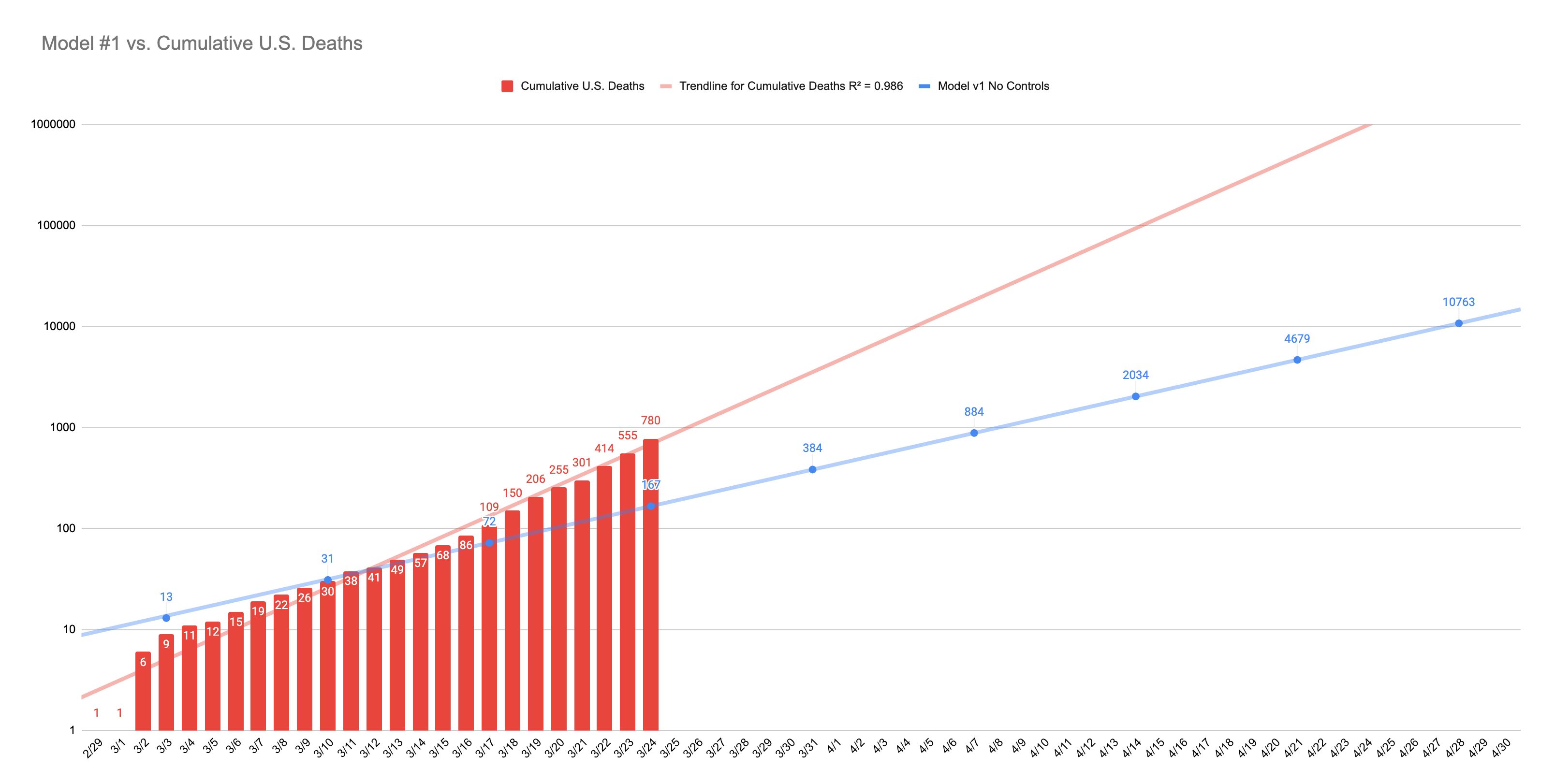
Clearly something was off about my assumptions. The slope of my line was not nearly steep enough based on the actuals.
But modifying assumptions wasn't the only thing that I could do. After several weeks we also had new information that could be incorporated to help us create a more reliable forecast.
New Information: Undiagnosed Cases and Reproductive Interval
Undiagnosed Cases
One of the biggest challenges in forecasting the impact of coronavirus is the lack of testing. We know that not everybody who gets the virus is being tested. That is in part because we don't have enough tests and in part because many infected people display few to no symptoms.
A study published in Science indicates that there may be five to ten times as many cases of COVID-19 in the population than reported cases. I used this information to add a new assumption to version 2 of the model. Now, instead of starting at zero infections, we can start at any point in time by multiplying the number of confirmed cases by somewhere in the range of 5 to 10.
Reproductive Interval: 7 days to 4 days
The reproductive interval is the amount of time it takes an infected individual to transmit the virus to others. In the v1 model, I used 7 days for this assumption, since at the time estimates ranged from 3 days to 14 days or more.
It turns out it's closer to the lower end of that range. An article on the CDC website indicates that the reproductive interval is closer to 4 days. As you'll see, this fits the trend in New York City, where the death rate has been doubling almost twice a week.
Reforecasting the U.S. growth of COVID-19
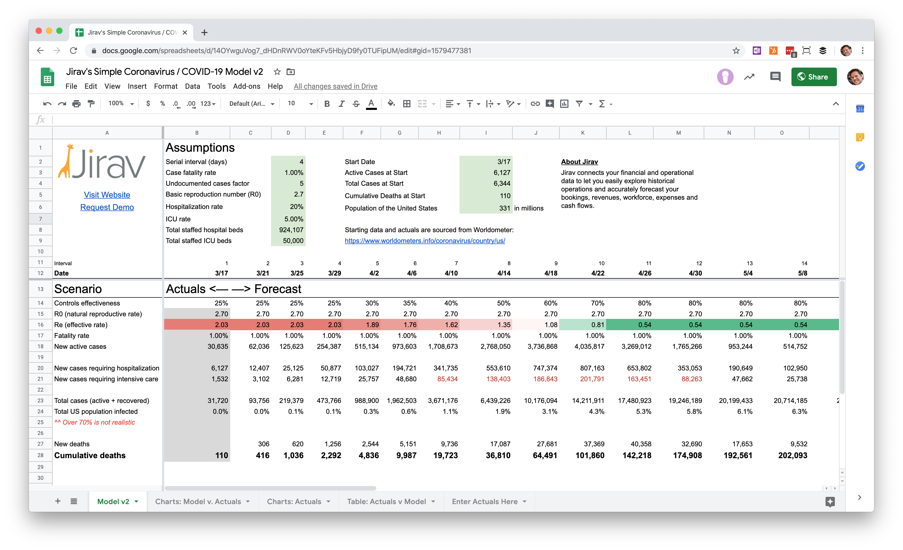
With this new information, I created a version 2 of the model which you can access here in Google Sheets. (From the menu, select to File > Make a Copy if you want to copy the spreadsheet into your own Google Drive so you can test your own assumptions.)
Version 2 allows you to choose a starting date of actuals, then compare the forecast to past results to see how closely it tracks the actual numbers.
You can also set the effectiveness of controls for each interval. For example, I've assumed that controls through the end of March have only been 25% effective in reducing the reproductive rate on a nationwide basis.
I also tweaked the reproductive rate to 2.7 to make my forecast track better on a historical basis with the cumulative reported deaths.
As you adjust the controls effectiveness percentage to reduce the reproductive rate, you'll notice that the total deaths swing dramatically depending on when that rate drops below zero.
For example, if we acted immediately at the end of March to make that happen by doubling or tripling current social distancing efforts on a nationwide basis, we might be able to keep deaths under 30,000. If we instead gradually increase controls through the end of April to get the rate below zero, we end up with over 500,000 deaths.
When will things get back to normal?
Either way, it is unlikely that the economy will reopen in May or even June.
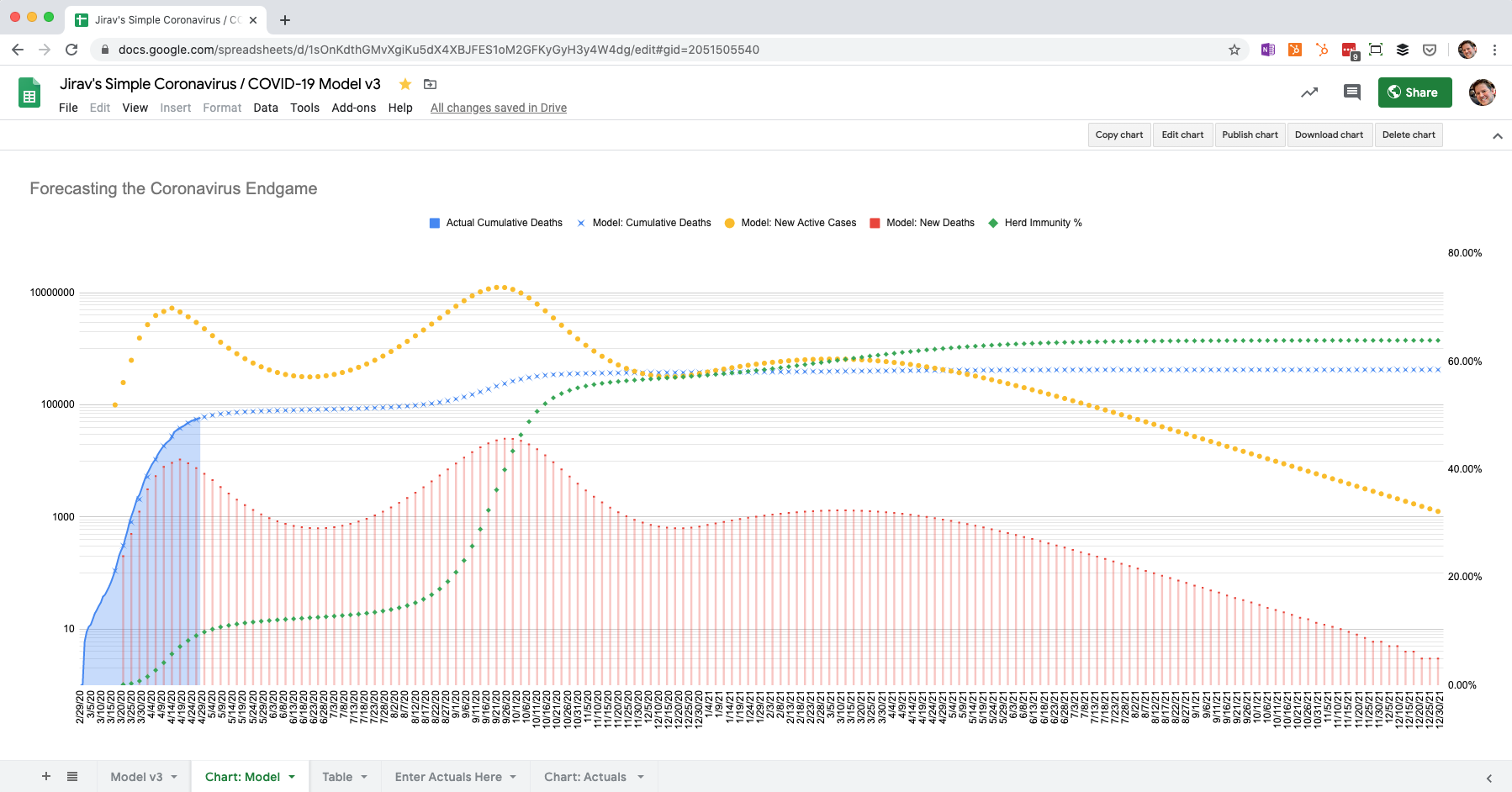
A scenario between the two extremes (the chart above) shows the number of active cases peaking in the second half of April with over 3 million people infected at the apex. That means hospitalizations will peak a few weeks later in May, and deaths shortly after that.
That's why I'm betting things don't get back to normal until July or August.
You need a financial model and forecast
This is a big reason why at Jirav we're encouraging our partners and prospects to start building out 6- to 12-month financial models in addition to creating short-term cashflow forecasts. The economic disruption that started in March is likely to continue through April, May, June, and possibly one or two months more.
Jirav makes financial modeling way faster than doing it in spreadsheets, but it can still take half a day or more to build out a driver-based financial model in our app. That's why we've created a special COVID-19 Quick Financial Forecast Template. Using this template, we can set you up with Jirav, connect your accounting system, and create a full three-way financial statement forecast in 30 minutes or less.
If you're interested in seeing the COVID-19 Template in action, or learning more about Jirav in general, watch our on-demand webinar, Forecasting the Economic Impact of COVID-19, or request a 1-to-1 demo.


